PROJECT NO. O1

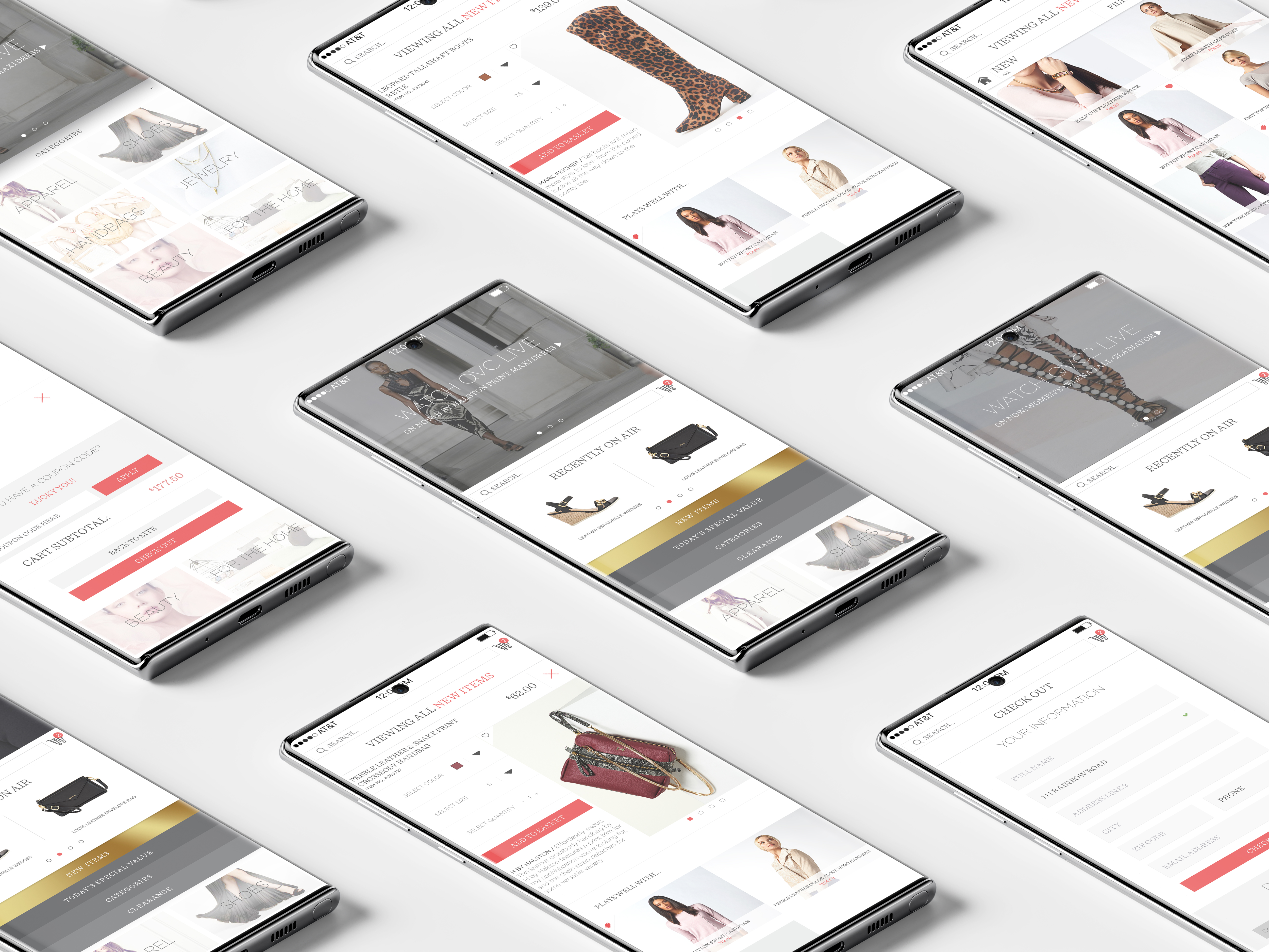
QVC is truly a hidden gem. While it doesn’t face the same pressure to stock and run hundreds of stores like traditional brick-and-mortar retailers like such stores as Wal*Mart, QVC still faces competition from all corners of e-commerce, including Amazon.com Inc.
Anything and everything is already available online and there are all kinds of niche sites out there to help people discover new items,” said Sucharita Mulpuru, chief retail strategist for conference producer Shoptalk. “That’s something available in spades anywhere you turn online.” Since QVC has such an extensive and robust assortment of products, their mobile app felt dated in exhibiting them in the best light possible.
This project was created to keep up with rising user experience trends; QVC has 3 channels to stream at the time of writing this, which in turn provides a better app experience.
Blurring the lines of TV and internet sales is certainly an interesting service and it was an experience to merge the two into a seamless experience to create the best possible shopping experience for the customer as a whole.
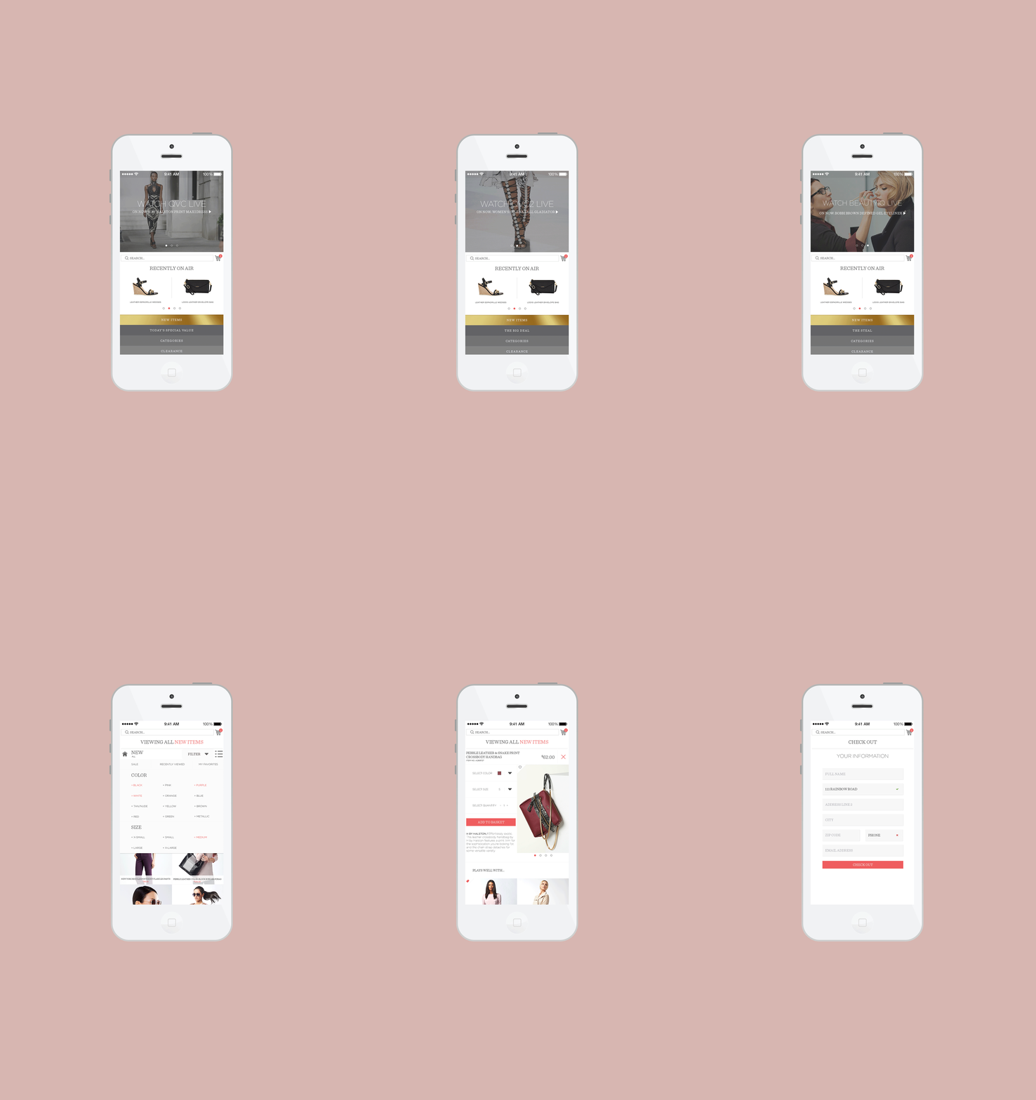
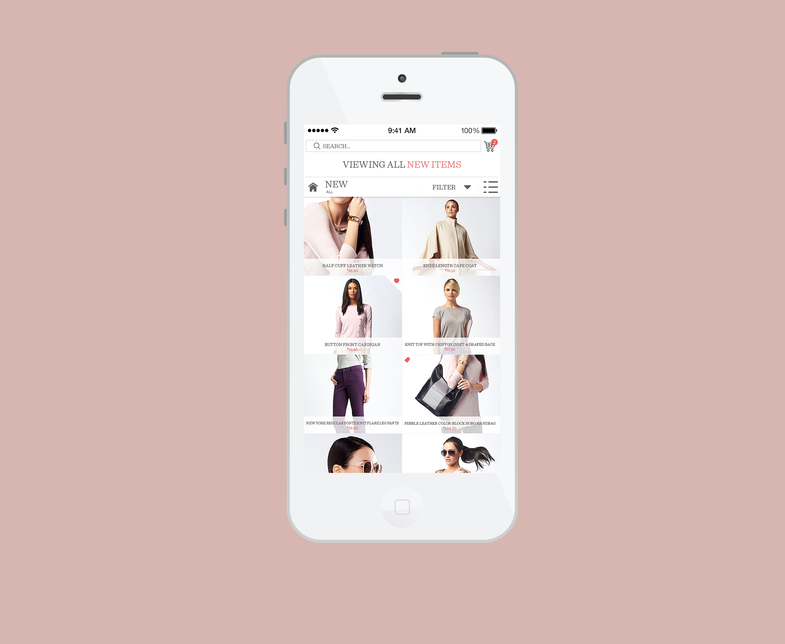
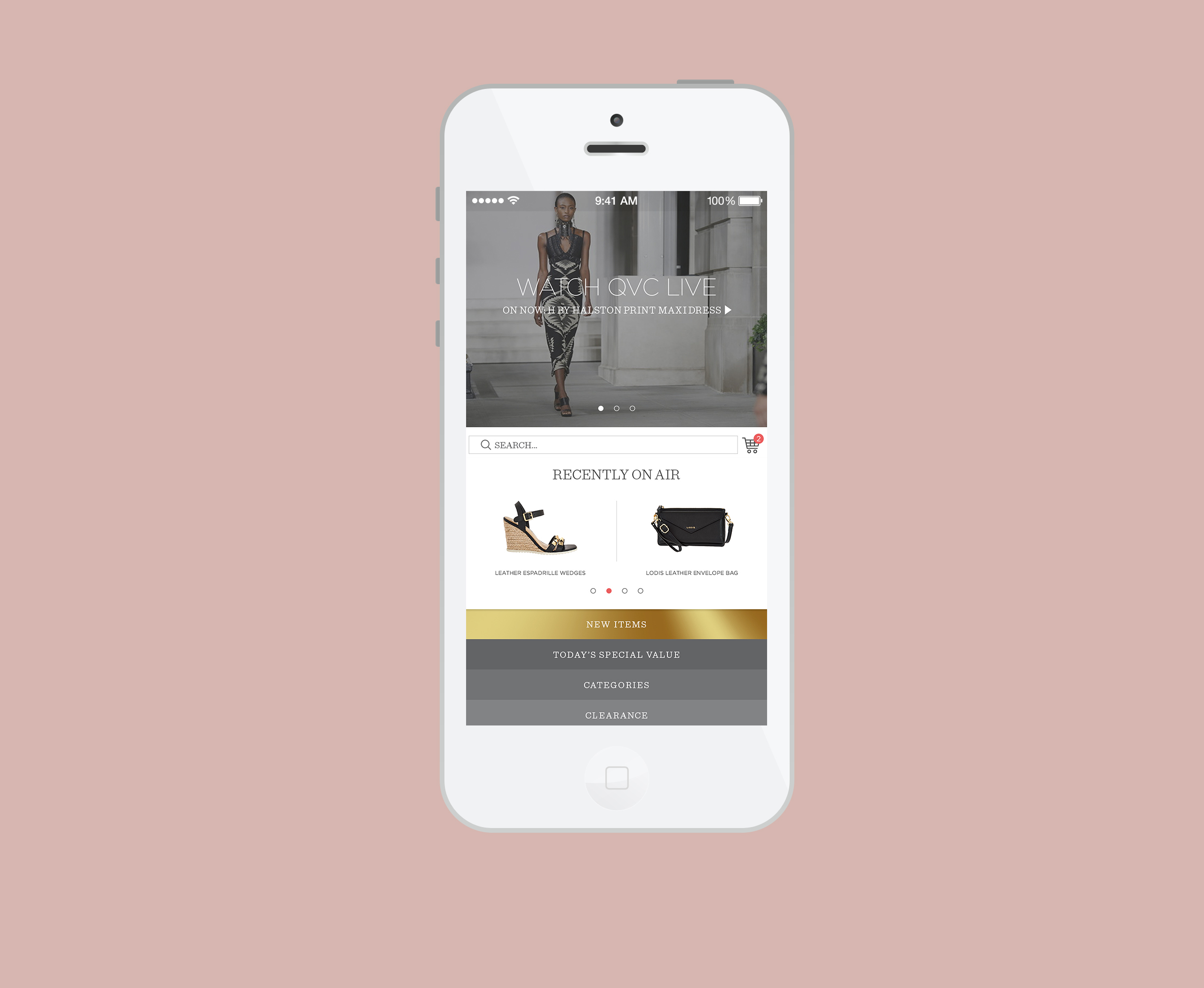
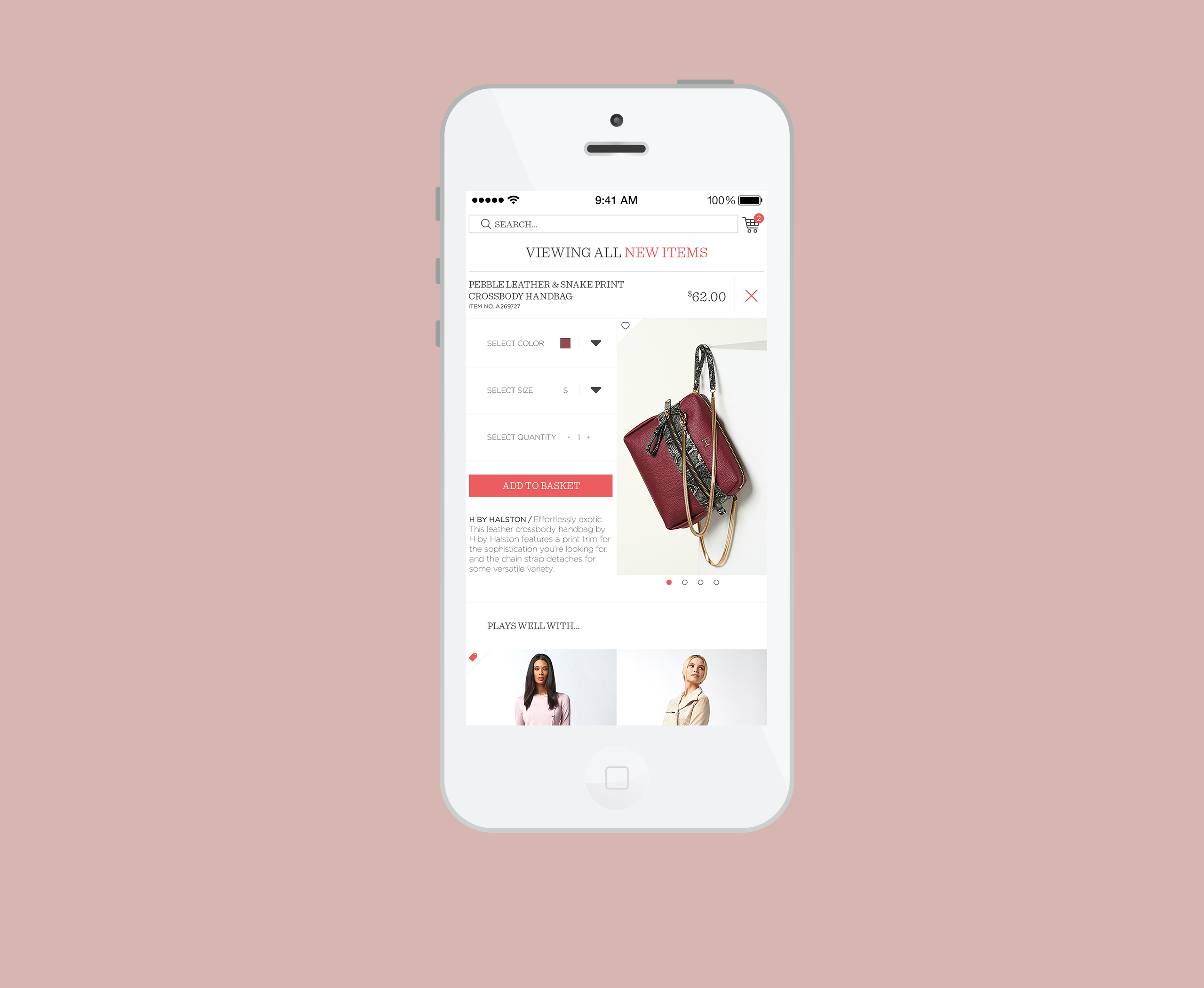
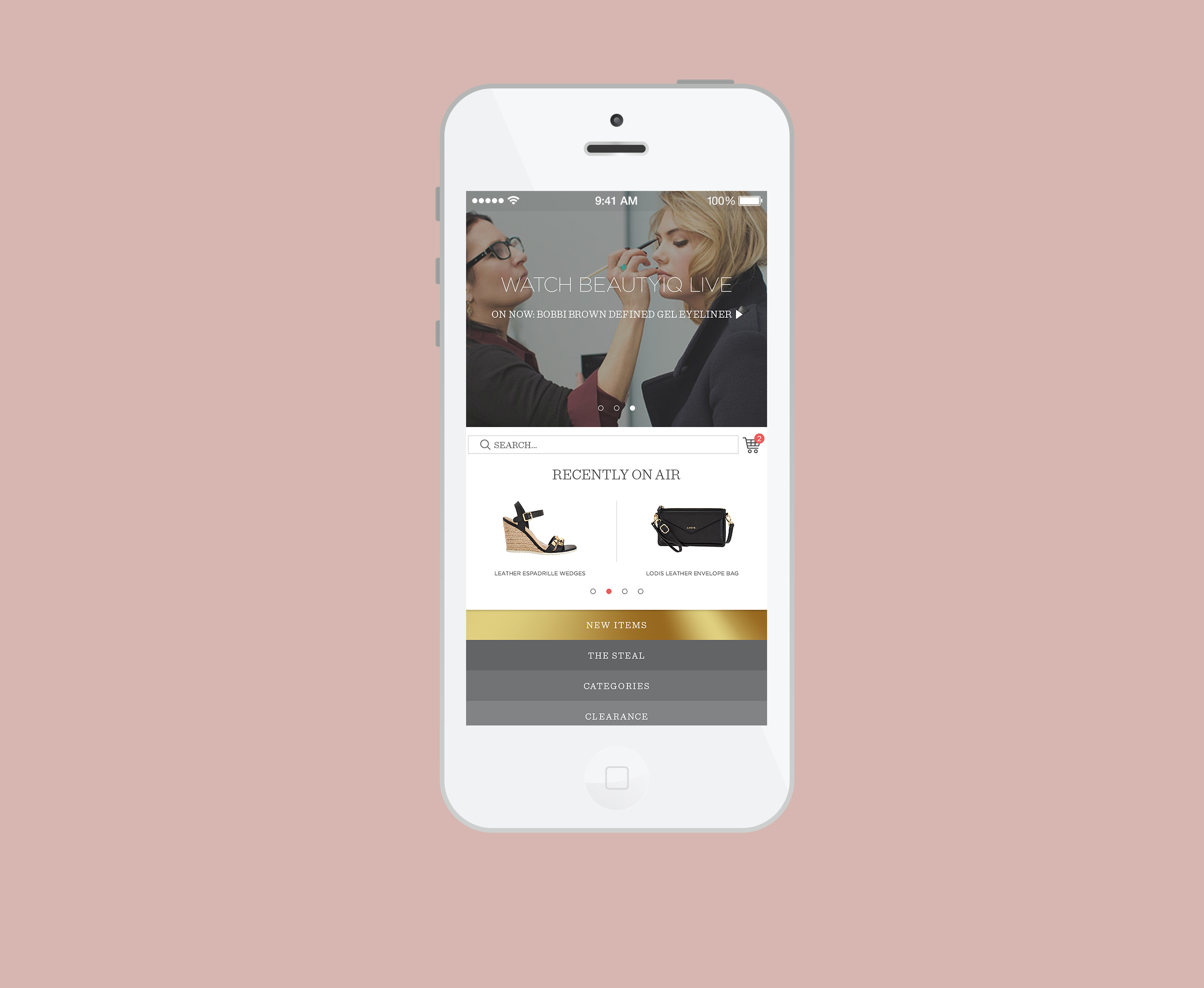
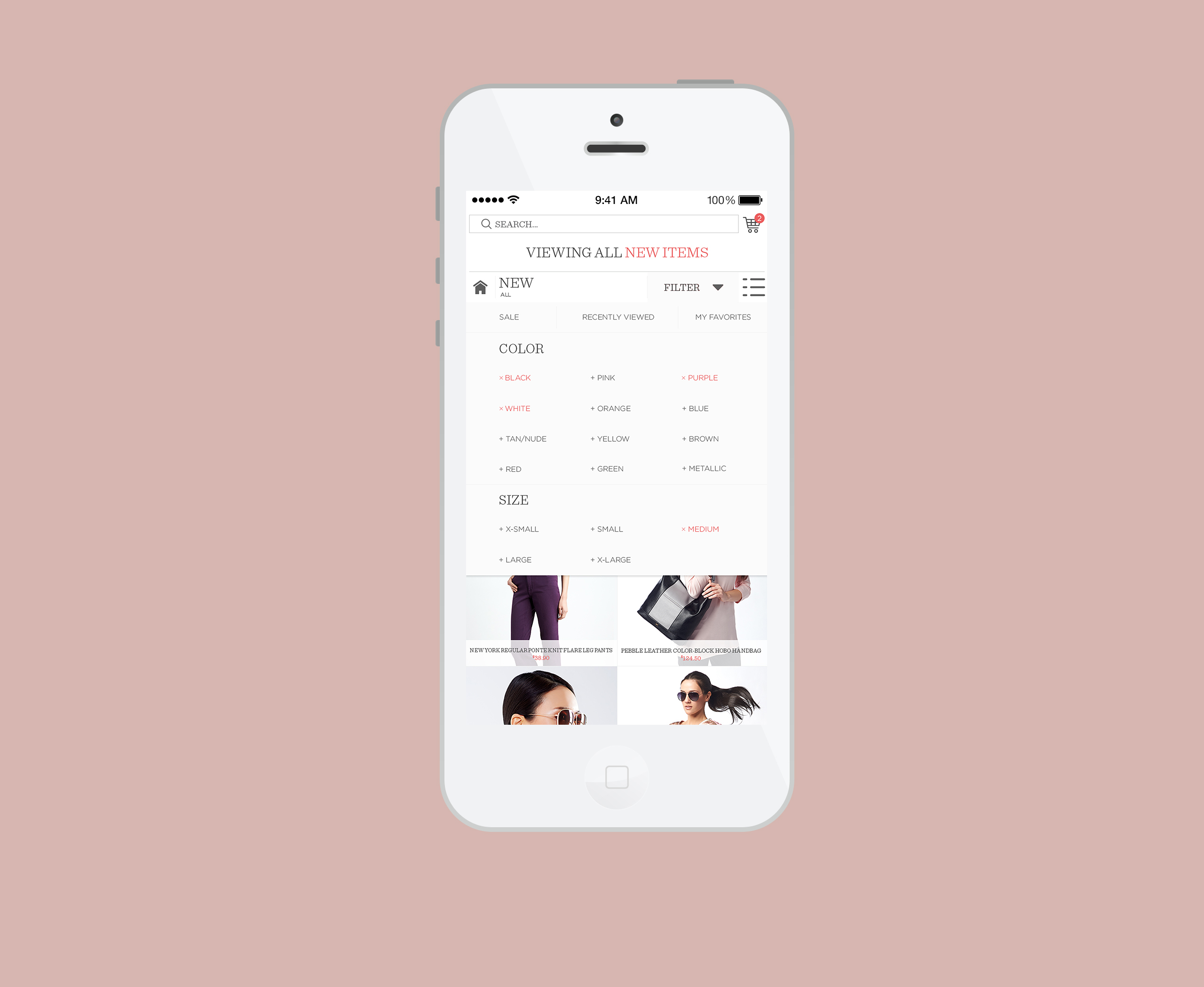
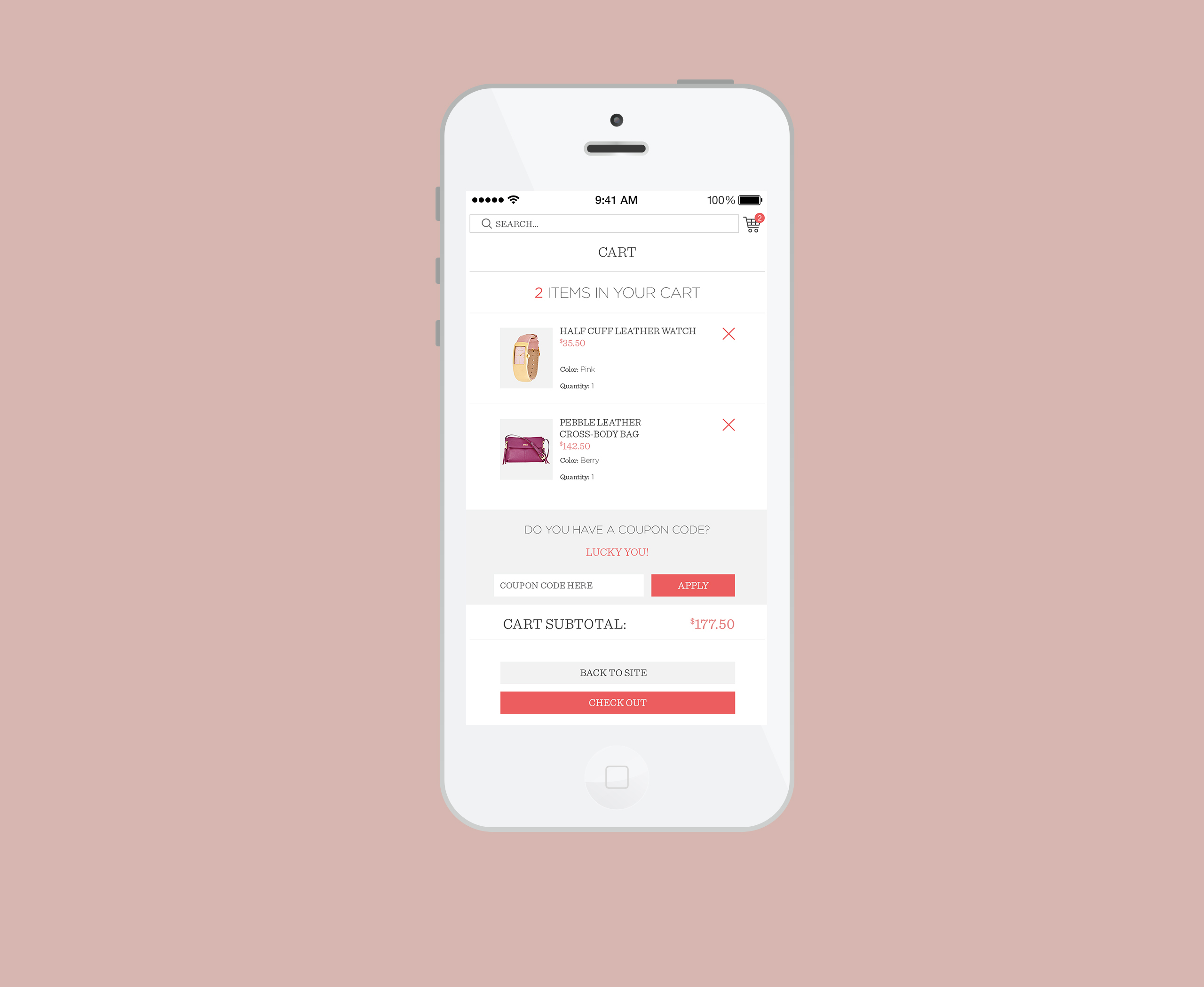
With a new look for each product display page, a heart button for quick favorites//wishlist adds, and a clean checkout process, this new app compared to the old one puts the customer experience first. The home screen elevates the experience of shopping what you see; the customer would be able to stream the live TV show while seamlessly shopping for items they see on-air. Alternate cards moving up into view with a simple tap is also utilized; the customer can quickly see the Today’s Special Value [TSV], categories and clearance, something the app never had before. Once the newly added items call to action button is tapped on, a new screen loads up with a clean, new look for product listings. From here, the customer can choose in the top navigation if they want to see certain colors, sizes, etc by clicking on ‘+ additional filter’. If a specific product is tapped on, the newly designed product display page loads up and takes an in-depth look at the item, giving easy options for purchasing a certain size, color and quantity.
With a new look for each product display page, a heart button for quick favorites//wishlist adds, and a clean checkout process, this new app compared to the old one puts the customer experience first. The home screen elevates the experience of shopping what you see; the customer would be able to stream the live TV show while seamlessly shopping for items they see on-air. Alternate cards moving up into view with a simple tap is also utilized; the customer can quickly see the Today’s Special Value [TSV], categories and clearance, something the app never had before. Once the newly added items call to action button is tapped on, a new screen loads up with a clean, new look for product listings. From here, the customer can choose in the top navigation if they want to see certain colors, sizes, etc by clicking on ‘+ additional filter’. If a specific product is tapped on, the newly designed product display page loads up and takes an in-depth look at the item, giving easy options for purchasing a certain size, color and quantity.
︎ BACK