

Grey Nun believes that an excellent elementary education is more than the sum of its elements. It is the result of a well-balanced approach that blends the interests, needs and talents of individuals into a welcoming community. It comes from seeing students not as blank books waiting to be filled with the same facts, but as artworks in progress, who discover their potential by questioning, thinking creatively and seeing the big picture.
Grey Nun Academy is a community committed to a learning process that allows each child to attain a fuller knowledge of self, world and God.
Grey Nun Academy is a community committed to a learning process that allows each child to attain a fuller knowledge of self, world and God.
LOGO EXPLORATIONS
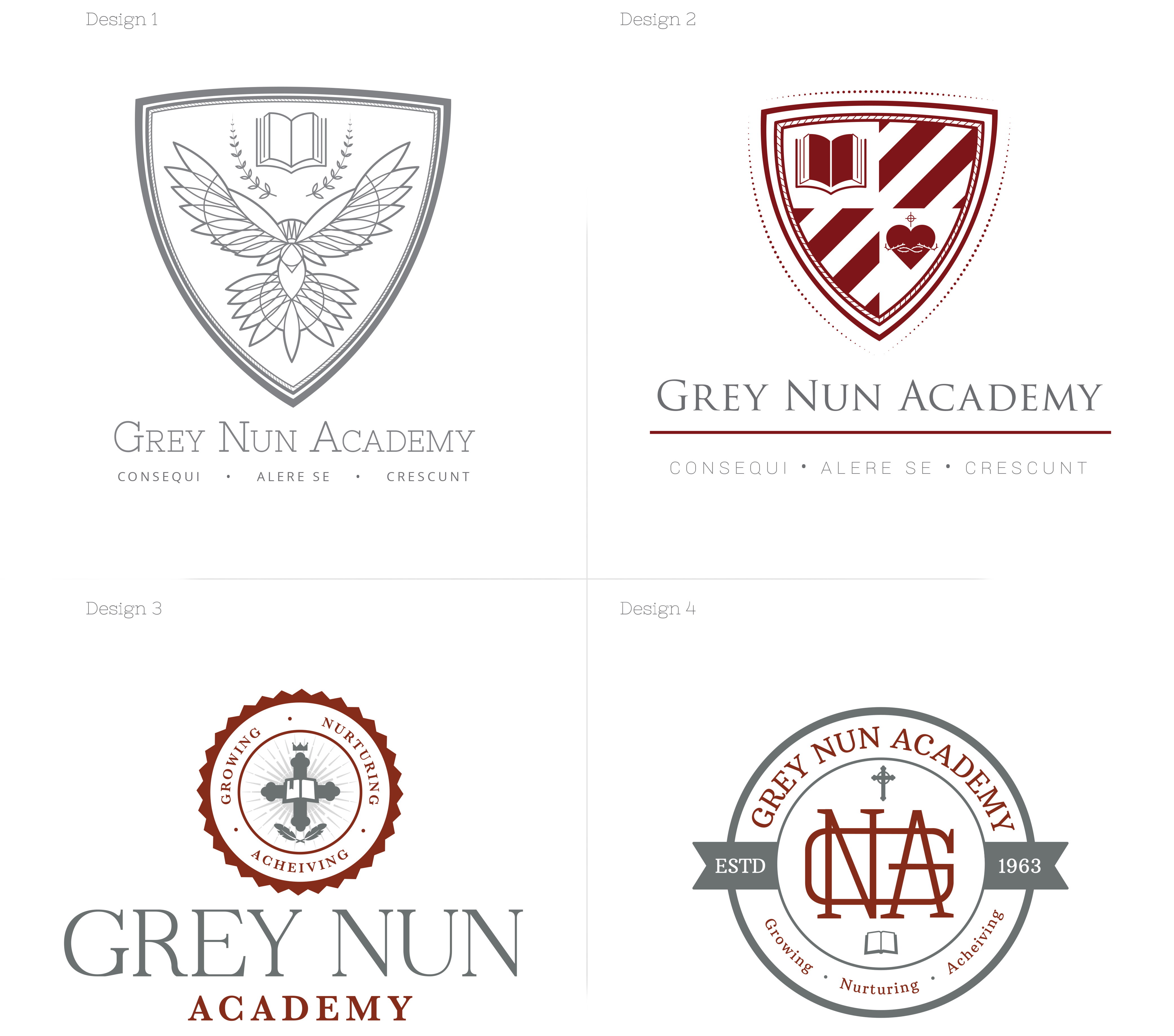
Design 1 refers to the symbol of the dove to represent compassion - one of the three things that Grey Nun Academy's program teaches to their students. Within the dove in the center of the shield is a subtle trinity knot, but can also represent the three teachings that Grey Nun Academy puts into play.
Design 2 features a book and the Sacred Heart. The diagonal stripes refers to the preeminence of the school. Open books can also refer back to Grey Nun’s mission, which is that they see students as those 'who discover their potential by questioning, thinking creative and seeing the big picture'.
Design 2 features a book and the Sacred Heart. The diagonal stripes refers to the preeminence of the school. Open books can also refer back to Grey Nun’s mission, which is that they see students as those 'who discover their potential by questioning, thinking creative and seeing the big picture'.
Design 3 is in the shape of the classic seal. It represents Grey Nun Academy's learning process.
Design 4 symbolizes more of a monogram-type design and focuses on the history of the logo [established date, cross, etc.] while retaining the seal shape.
All logos keep to Grey Nun Academy's maroon and grey original color scheme and offers a modern, fresh new look for the private school.
Design 4 symbolizes more of a monogram-type design and focuses on the history of the logo [established date, cross, etc.] while retaining the seal shape.
All logos keep to Grey Nun Academy's maroon and grey original color scheme and offers a modern, fresh new look for the private school.
